Introduction
In software development, design is essential to creating great user experiences. Unfortunately, it is often undervalued or taken for granted. This section emphasizes the importance of design and its impact on the success of software products.
The Importance of Design
Although design is crucial, it is often overlooked or considered secondary to technical aspects in software development. This section explores the tendency to undervalue design and the potential consequences of neglecting it.
Principles of Visual Design
Visual design is a fundamental aspect of creating engaging and effective user experiences. Understanding the principles of visual design, such as contrast, alignment, and hierarchy, can help developers create more visually appealing and intuitive interfaces without relying on pre-made frameworks like Bootstrap or Mui. By taking a more intentional approach to visual design, developers can create software products that stand out and provide a better user experience.
The list I'll go through isn't in any particular order of importance, as they are all equally important.
Visual Hierarchy
To create effective visual hierarchy in design, prioritize content and use principles such as contrast, size, and spacing to direct attention to the most important information. Effective use of visual hierarchy can produce designs that are both visually appealing and easy to navigate.
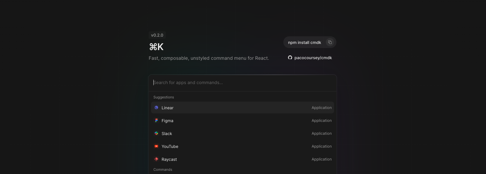
Lets look at \\linear’s Integration page
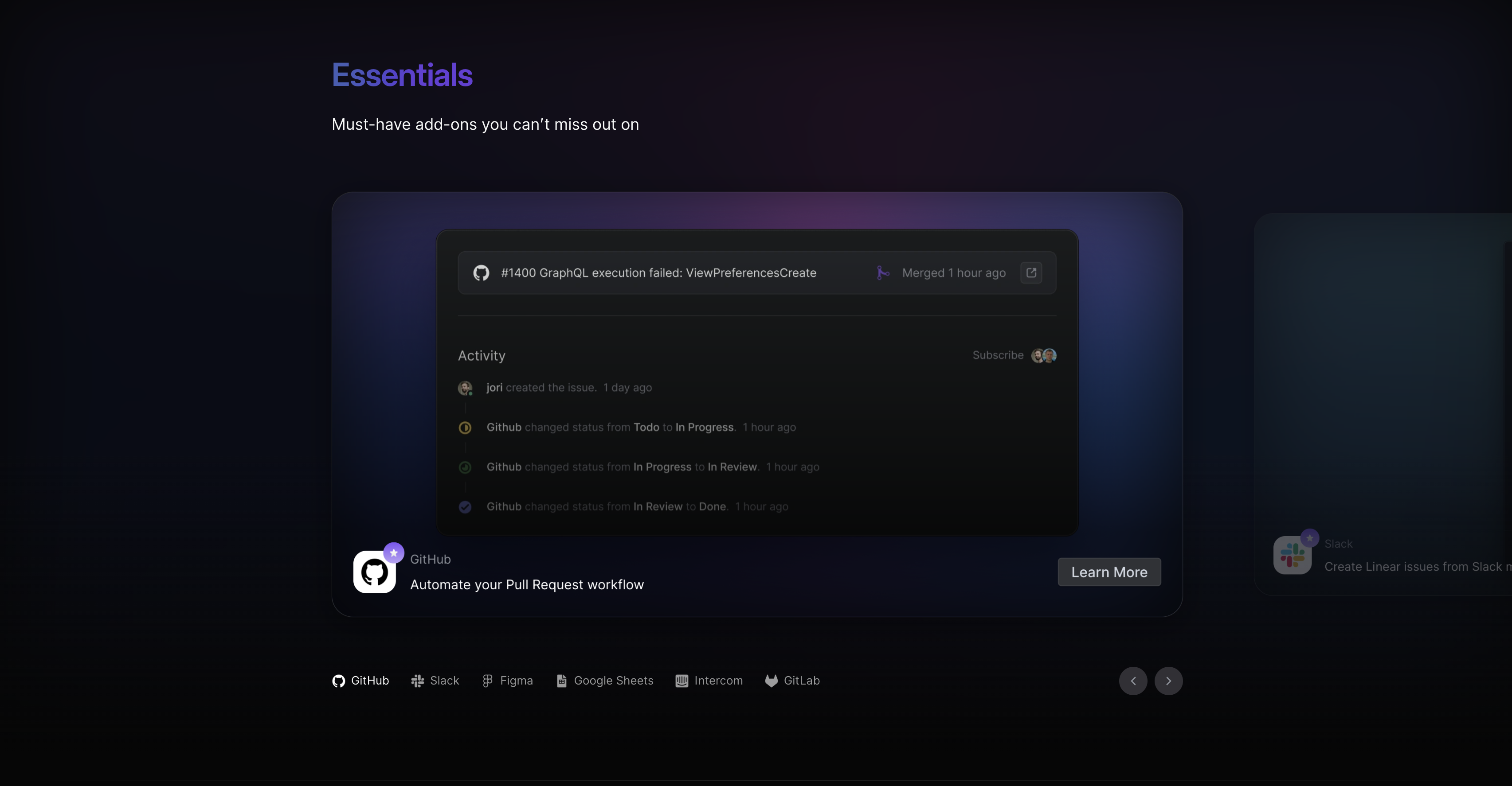
How is Content Prioritized?
This section serves to provide a list of all available integrations, while also emphasizing the importance of each integration rather than just listing them out.
To achieve this, the content is visually highlighted by centering the items in the list of integrations one at a time.
The items are sorted based on popularity among the user demographic for which the product is intended. In this particular case, GitHub integration was the most popular and therefore listed first and center, followed by Slack and others. This is because the product majorly targets software development teams.
We can see that this list is highlighted by being labeled "Essentials" and by its color. It is highlighted enough to draw attention to itself, but not so much as to be more attractive than the content section itself.
Contrast, Size, and Spacing
The selected item is the largest in size to attract the most attention, but the second item is also shown slightly to provide some presence and an easier way to quickly navigate to the next item while giving a bigger touch/action target for the user to click on. Despite the list of all items at the bottom, this approach draws attention to the selected item and emphasizes that it is part of a horizontal list.
This does not render the bottom bar redundant, as it still provides a quick glance of all the integrations to the user. The lower contrast and spacing of the bottom bar from the main content help the main content to stay highlighted without overwhelming the user with content from all the other integrations.

Color Theory
Color theory is crucial to visual design. Knowing the meanings and associations of colors and using them effectively can elevate the impact and effectiveness of a design. Developers can use color theory to create visually appealing and communicative designs that enhance the user experience.
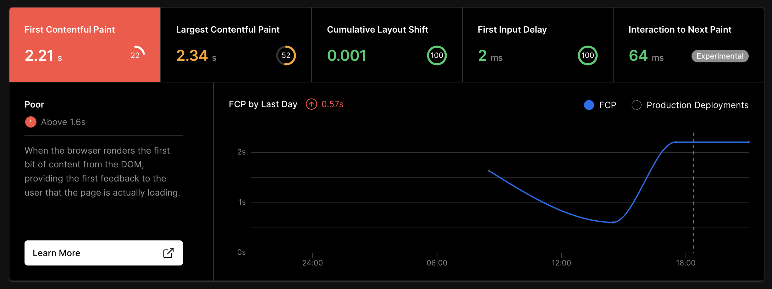
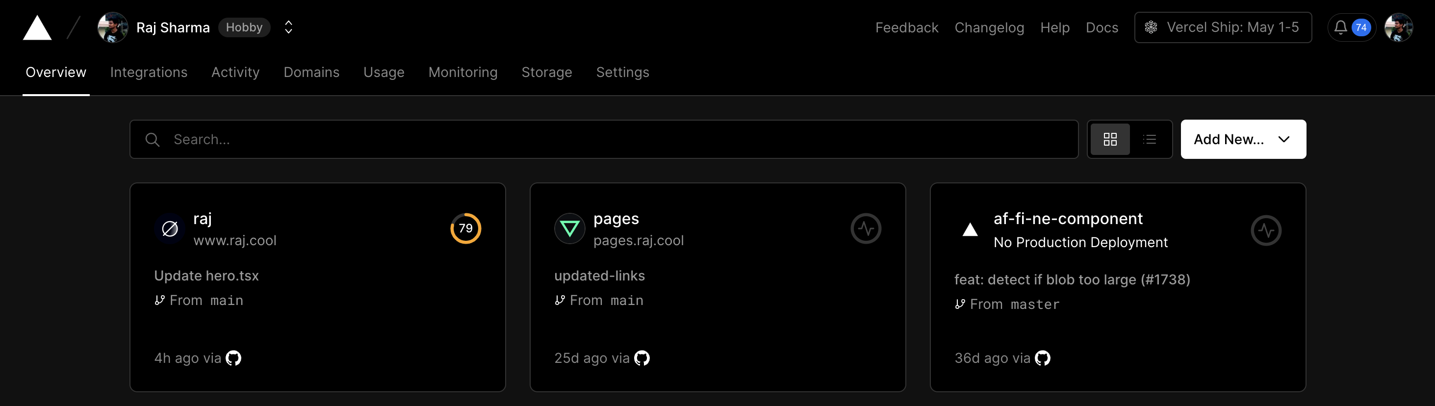
**Lets look at the a section from \*\*\*\*Vercel’s\*\*** insights dashboard page.\*\*
Semantic Colors
In the above example, we can see that good use of colors can replace the need for extra icons or descriptions to explain the significance of the numbers in the stats component.
Another example is Nextcloud’s Status Picker
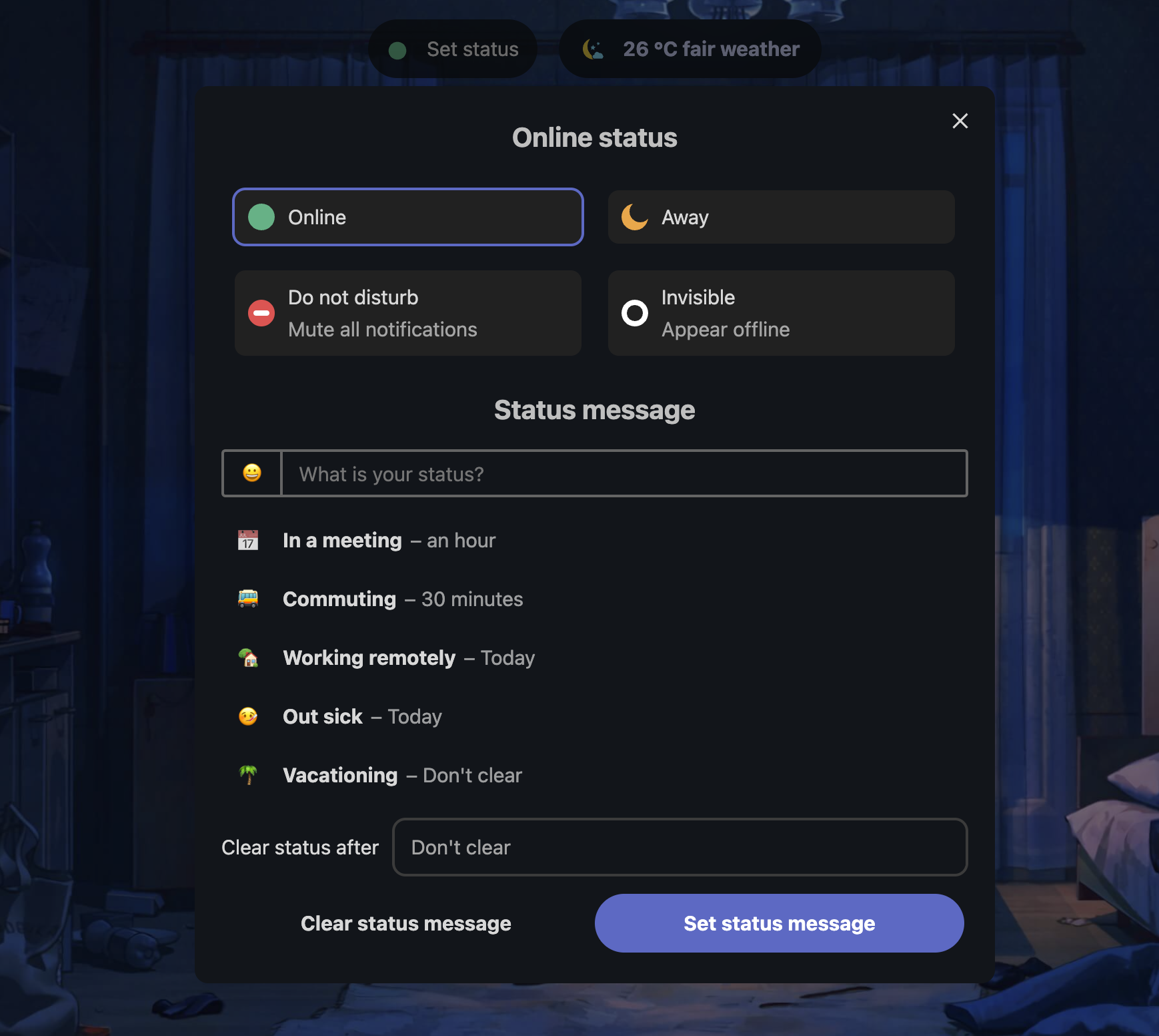
Nextcloud can accomplish this because they use accents sparingly on each page. As a result, it can also serve as a highlight.
Monochrome
Using too many colors can confuse users. It's important to be judicious with colors, even when using a single color. There are often multiple shades available, so we should choose one that is sufficient without overwhelming users.
Lets look at \\monkeytype
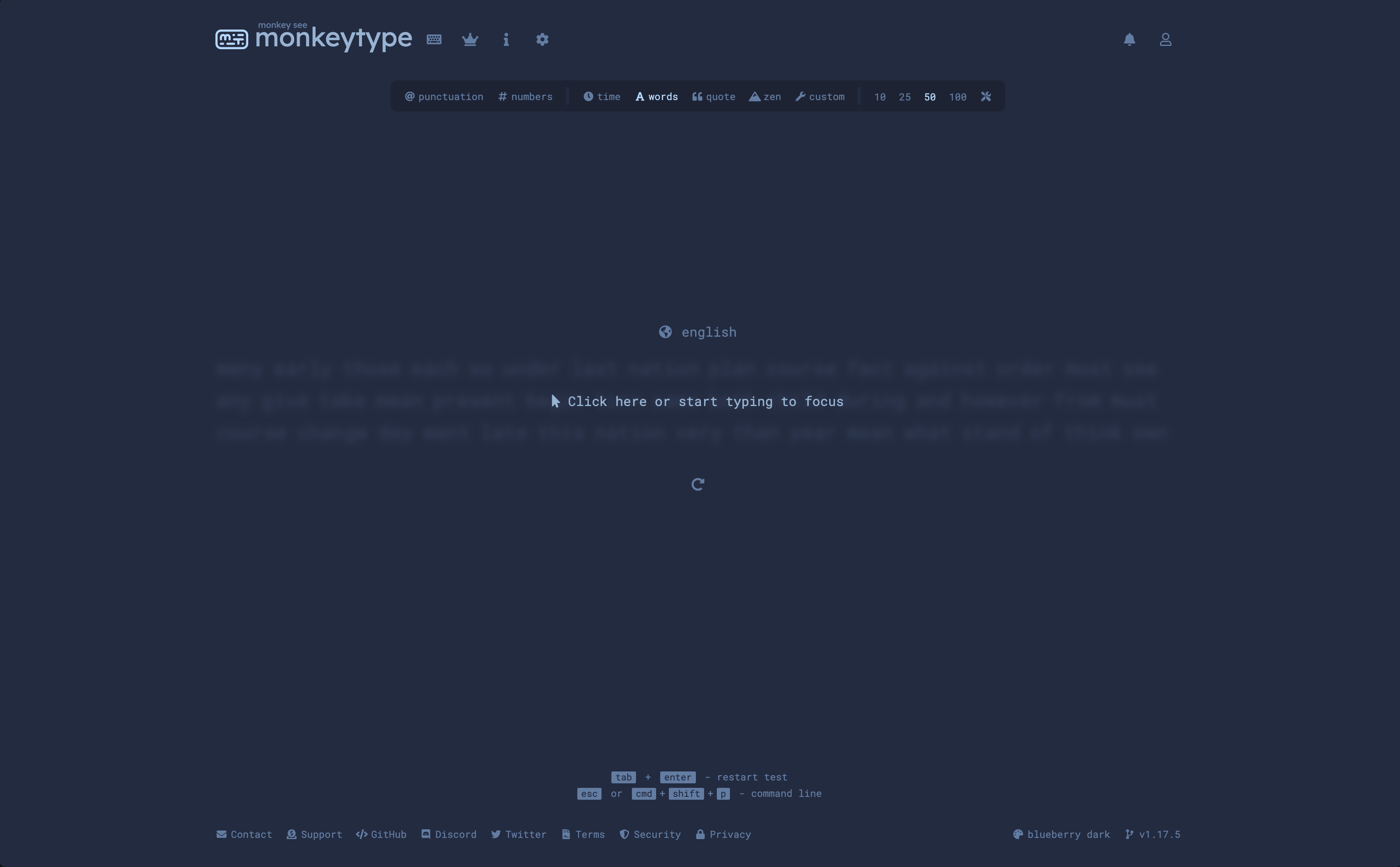
This site is an extreme example of using only a single color. However, it works well because it allows users to focus on typing without being distracted by various options and elements. This demonstrates that it is possible to make something visually appealing while being efficient with our use of color.
More cool mono examples
The recent redesign of YouTube uses white and black as the main accent colors, despite the brand color being red.
Are Colors Boring in Modern Design?
Although many modern designs tend to use more subdued or monochromatic color schemes, colors are anything but boring or unimportant. In fact, when used strategically and purposefully, colors can still have a huge impact on the overall look and feel of a design. They can help create minimal designs that make even the most complex tasks look simple.
Using simpler colors can make it possible to build user interfaces that blend into the background of the user's mind, allowing them to focus on using the product.
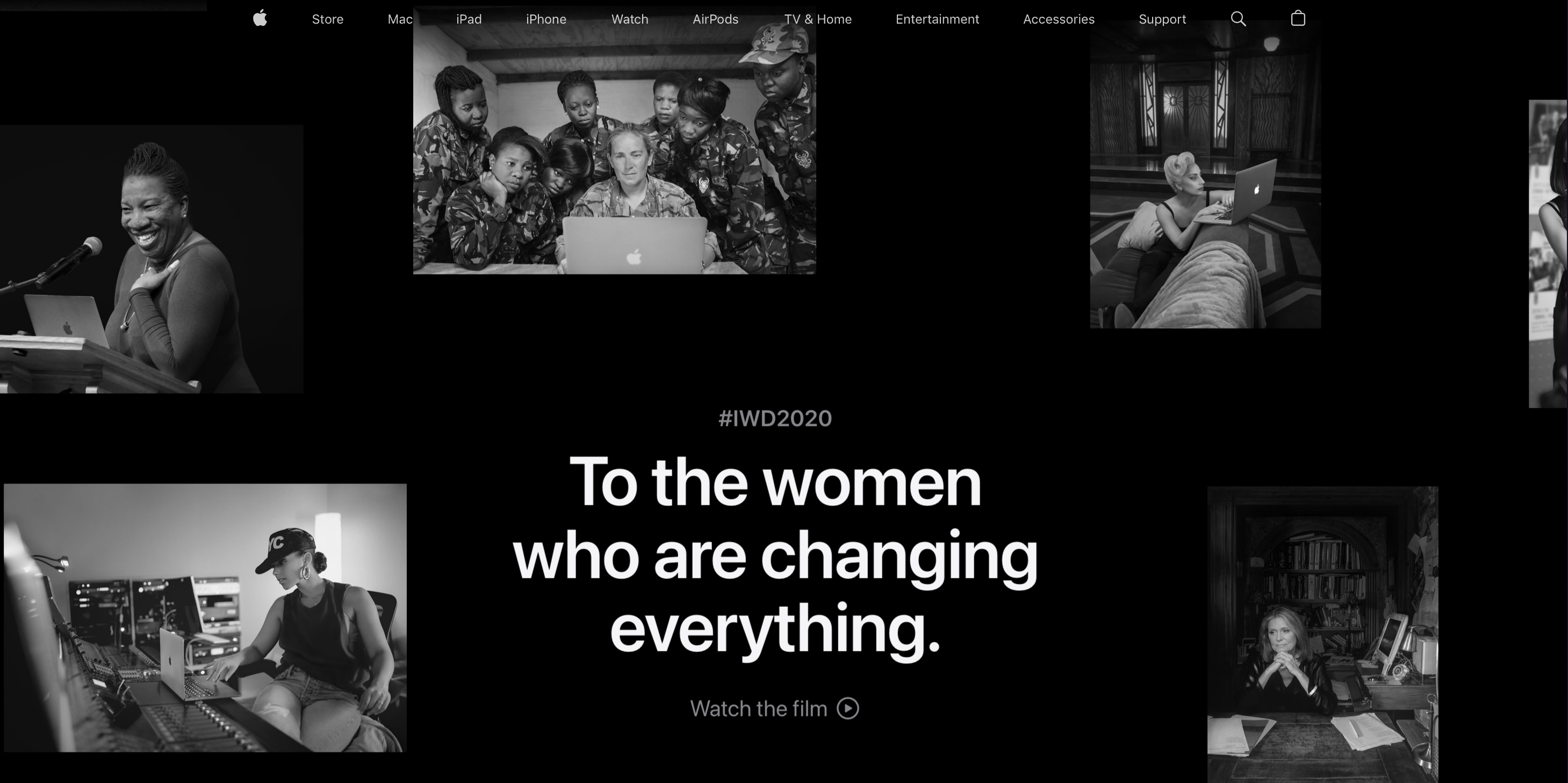
And finally, this is the best monochrome design I've ever seen.
Apples 2020 Women’s Day Website
Typography
Typography is an essential aspect of visual design that is often overlooked. However, the right choice of typography can make a significant impact on the overall look and feel of a design. Typography refers to the style, size, and arrangement of text on a page. In this post, we'll explore the importance of typography in visual design and how it can be used effectively.
Readability
One of the most important considerations when it comes to typography is readability. Text that is difficult to read will be a turn-off for users and can affect the success of a product. When it comes to choosing typography, it's essential to consider the size of the text, the spacing between letters and lines, and the contrast between the text and the background.
Low Contrast
While this text may seem fine at first, it can become difficult to read after a while. To ensure optimal contrast between text color and background, you can check out this article:
https://medium.muz.li/the-science-of-color-contrast-an-expert-designers-guide-33e84c41d156
The article delves into color contrast calculations for most use cases.
High Contrast
To ensure readability on a dark background, adjust the text. In the example above, the high contrast of black and white provides the highest possible readability. However, it can cause eye strain because the text is too bright compared to the rest of the page. To prevent eye strain, dim down the brightest parts of the page, including icons that follow the text color or make the overall background slightly brighter than pitch black.
White Space and Simplicity
White space is an effective tool in design that can guide attention, create balance, and give a clean look. Minimal design elements can make navigation and understanding easier. Designers can use these principles to highlight important information and create more effective and efficient designs.
On this page, the left side has intentionally been left blank (if you're viewing this on desktop) in order to center the actual content and draw more attention to it. This format is commonly used for most blogs.
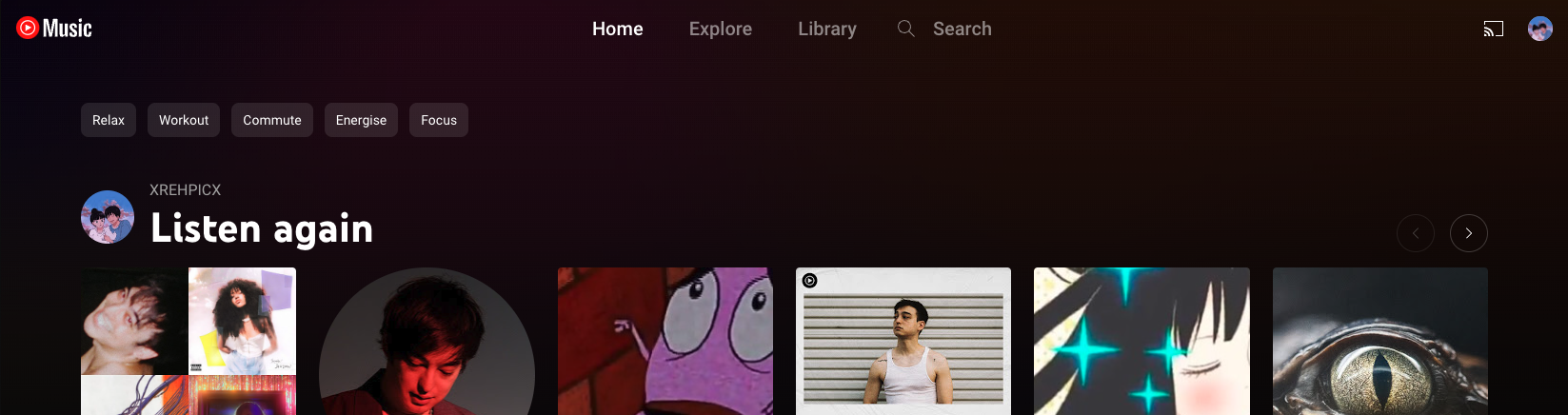
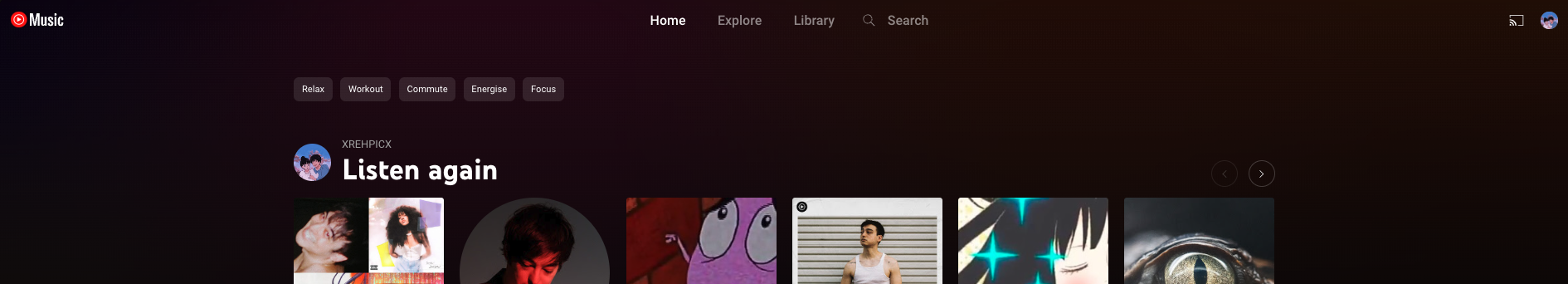
When examining the new UI of YouTube Music, we can observe that the header has increased space for navigation and filters. As a result, the recommendations are brought closer to the center of the page, which is where users typically focus when they visit the site.
Max Width
Most websites have a maximum width that's set to their main content container. This is to simplify content consumption, even for users with larger screens. If the content was too wide, users would have to move around a lot to view it all. The maximum width makes content consumption more comfortable and focused, though it may seem like a disadvantage.
Here are some examples of this happening on the most popular sites.
When prototyping, try out different values for your content's maximum width. Choose the one that feels best for your content.
Imagery and Iconography
Imagery and iconography are important components of visual design. They can establish emotional connections, convey intricate concepts, and direct user focus. It is crucial to select imagery and icons that are fitting for the design's context and purpose, while also maintaining consistency with the rest of the product. Generating these elements from scratch can be challenging, so it is often more straightforward to start with some of the standard icons that I will provide links to shortly.
The list in this example has consistent colors and spacing, making it easy to read. Icons are also used to help users quickly understand the list without reading all the text. This makes for a better user experience.
Icons can also display the status of certain items, enabling users to avoid unnecessary clicks and mentally filter out unfinished items, among other benefits.
Some of the most commonly used standard sets of icons are:
MUI’s Icons
These icons follow Google's Material UI icon style, which can be easily recognized by most Android/Google users. You can choose from over 2.1K icons, so you can find an icon for almost anything.
Heroicons
If you think there are too many MUI-based icons, try using this package instead. It's simpler and has fewer options than MUI. It has around 300 icons that can be helpful for creating basic apps that don't resemble Google's services. The icons were created by the creators of Tailwind CSS.
Radix Icons
This style is well-designed and has fewer icons. It also has excellent React support similar to MUI icons. With this package, most icons can be auto-imported, which makes it faster to work with compared to Heroicons or MUI.
Lucide
This option is one of the best I've found if you like the appearance of Heroicons but also want the automatic import from Radix and the variety from MUI. The icons have their own style and can be easily imported if you're using TypeScript. With a selection of almost 2,000 icons that cover almost anything you could need, there are packages available for almost all modern app-building frameworks.
How to avoid using pre-made design systems like Bootstrap or MUI.
Most of the fundamentals for design systems are already applied in the systems that come packaged with large component libraries. Replacing them would mean starting from scratch, which may seem too complex. However, it has been a while since the time when people needed things like Bootstrap, and CSS was actually hard to work with.
Since then, the community has built many revolutionary tools that make it much faster and simpler to build your own custom design system. These not only make developing your design system easy, but also help you incrementally migrate your existing MUI-based project, as they can work alongside most component libraries.
TailwindCSS
Tailwind CSS - Rapidly build modern websites without ever leaving your HTML.
Introducing a new and simpler way to write your CSS. Once you start using it, you'll find it hard to switch back to writing regular CSS. The plugins and tools built around this are amazing, making writing CSS easier than ever before.
99% of this website uses Tailwind instead of CSS.
Stitches
Stitches — CSS-in-JS with near-zero runtime
If you're familiar with the way MUI works and how it uses Styled Components, you can check out Stitches. It's a simpler, more performant and fun to work with version of @emotionjs or styled-components, created by the creators of Radix UI.
Headless UI
If you use MUI components for their functionality rather than their style, this is the library for you. MUI is a component library that provides only functionality and no styles. This allows you to easily incorporate your own custom design system without having to override any default styles just to make it look consistent with the rest of your page.
However, focusing only on a limited selection of components may not provide access to some of the more complex component functionality that MUI offers.